CODE:
Get the code used for this section here
Graphics: the basics
Introduction to the plot function
It is easy to produce publication-quality graphics in R. There are
many excellent R packages at your finger tips to do this; some of
which include lattice and ggplot2 (see the help files and
documentation for these). While in the course of these exercises we will
revert to using these other plotting packages, some fundamentals of
plotting need to bedded down. Therefore in this section we will focus on
the simplest plots; those which can be produced using the plot
function, which is a base function that comes with R. This function
produces a plot as a side effect, but the type of plot produced depends
on the type of data submitted. The basic plot arguments, as given in the
help file for plot.default are:
`plot(x, y = NULL, type = 'p', xlim = NULL, ylim = NULL, log = NULL, main = NULL, sub = NULL, xlab = NULL, ylab = NULL, ann = par('ann'), axes = TRUE, frame.plot = axes, panel.first = NULL, panel.last = NULL, asp = NA, ...)`
To plot a single vector, all we need to do is supply that vector as the only argument to the function.
    z<- rnorm(10)
    plot (z)
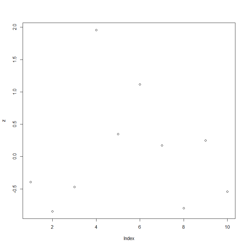
In this case, R simply plots the data in the order they occur in the
vector. To plot one variable versus another, just specify the two
vectors for the first two arguments.
    x<- -15:15
    y<- x^2
    plot(x,y)
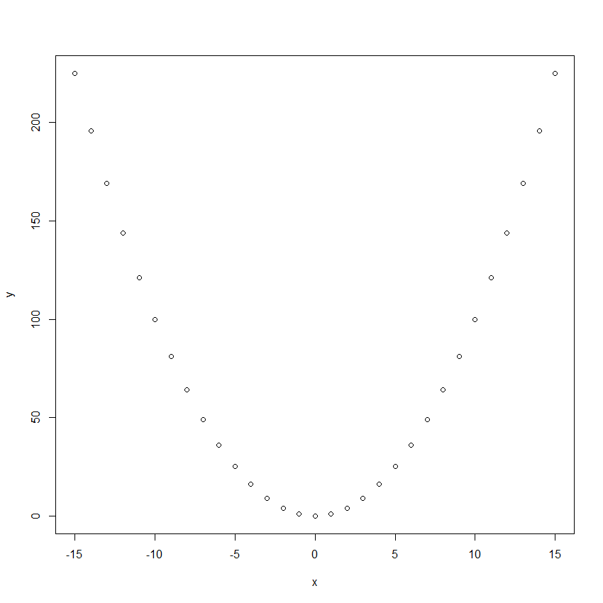
And this is all it takes to generate plots in R, as long as you like
the default settings. Of course, the default settings generally will not
be sufficient for publication- or presentation-quality graphics.
Fortunately, plots in R are very flexible. The table below shows some
of the more common arguments to the plot function, and some of the
common settings. For many more arguments, see the help file for par or
consult some online materials where https://www.statmethods.net/graphs/
is a useful starting point.
| Argument | Common Options | Additional Information |
|---|---|---|
lty |
0 1 or solid 2 or dashed 3 or dashed through 6 |
Line types |
pch |
0 through 25 | Plotting symbols. See below for symbols. Can also use any single character, e.g., v, or X etc. |
type |
p for points l for line b for both o for over n for none |
n can be handy for setting up a plot that you later add data to |
xlab, ylab |
Any character string, e.g. soil depth |
For specifying axis labels |
xlim, ylim |
Any two element vector, e.g. c(0:100), c(-10,10), c(55,0) |
List higher value first to reverse axis |
col |
red, blue, 1 through 657 |
Colour of plotting symbols and lines. Type colors() to get list. You can also mix your own colours. See “color specification” in the help file for par. |
bg |
red, blue, many more |
Colour of fill for some plotting symbols (see below) |
las |
0, 1, 2, 3 |
Rotation of numeric axis labels |
main |
Any character string e.g. plot 1 |
Adds a main title at the top of the plot |
log |
x, y, xy |
For making logarithmic scaled axes |
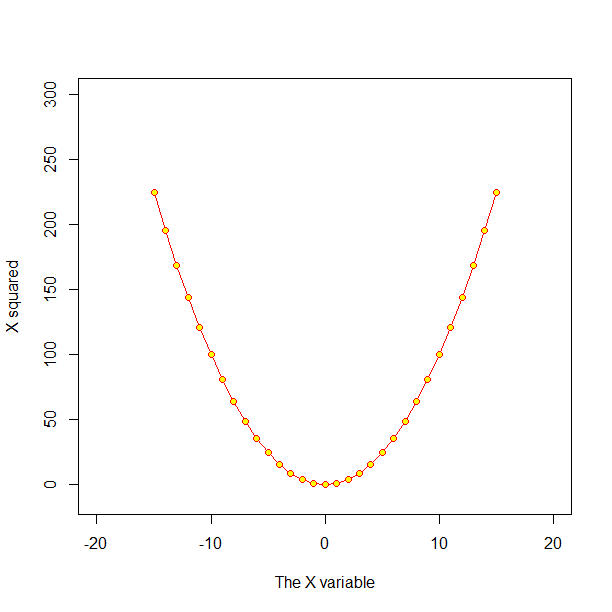
Use of some of the arguments in the above table is shown in the following example.
    plot(x,y, type="o", xlim=c(-20,20), ylim=c(-10,300),
         pch=21, col="red", bg="yellow",
         xlab="The X variable", ylab="X squared")
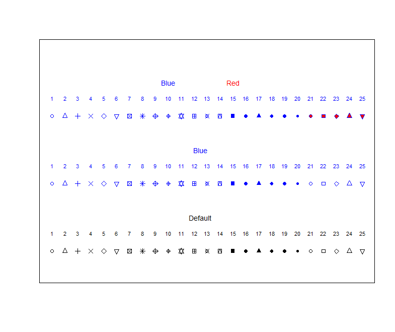
The plot function is effectively vectorised. It accepts vectors for
the first two arguments (which specify the x and y position of your
observations), but can also accept vectors for some of the other
arguments, including pch or col. Among other things, this provides
an easy way to produce a reference plot demonstrating R’s plotting
symbols and lines. If you use R regularly, you may want to print a
copy out (or make your own).
    plot(1:25, rep(1,25), pch=1:25, ylim=c(0,10), xlab="", ylab="", axes=FALSE)
    text(1:25, 1.8, as.character(1:25), cex=0.7)
    text(12.5, 2.5, "Default", cex=0.9)
    points(1:25, rep(4,25), pch=1:25, col= "blue")
    text(1:25, 4.8, as.character(1:25), cex=0.7, col="blue")
    text(12.5, 5.5, "Blue", cex=0.9, col="blue")
    points(1:25, rep(7,25), pch=1:25, col= "blue", bg="red")
    text(1:25, 7.8, as.character(1:25), cex=0.7, col="blue")
    text(10, 8.5, "Blue", cex=0.9, col="blue")
    text(15, 8.5, "Red", cex=0.9, col="red")
    box()
Exercises
-
Produce a data frame with two columns: x, which ranges from −2π to 2π and has a small interval between values (for plotting), and cosine(x). Plot the cosine(x) vs. x as a line. Repeat, but try some different line types or colours.
-
Read in the data from the
ithirpackage calledUSYD_dIndex, which contains some observed soil drainage characteristics based on some defined soil colour and drainage index (first column). In the second column is a corresponding prediction which was made by a soil spatial prediction function. Plot the observed drainage index (DI_observed) vs. the predicted drainage index (DI_predicted). Ensure your plot has appropriate axis limits and labels, and a heading. Try a few plotting symbols and colours. Add some informative text somewhere. If you feel inspired, draw a line of concordance i.e. a 1:1 line on the plot.